
The S10 visual language goal was to restructure future interfaces and connect Samsung's mundane interactions and amplify the everyday interactions. As an interaction designer collaborating with other designers, I work on creating and ideating on Samsung mobile native apps and experiences.
My Role
Research, User Flows, Information Architecture, Sketching, Wireframing, UI, Prototyping
I took ownership of the motion and delivered entire new designs for clock, music, profiles/contacts, call screen for S10 and future use. We worked closely with Samsung Korean mobile team to align With Samsung needs.
Problem
Users felt the mobile phone day to day experience was mundane. Interactions became predictable.
Issues from simple homescreen interface, lack of personalised experience, not cohesive motion experience,
High Levels Goals
In order for Samsung to present a cohesive image and rapidly overhaul its experiences, we needed a design system that documented all the UI patterns and guiding principles in a format accessible to the design and engineering teams.
1. Create a design system for S20 Visual language - Focussing on the alarm clock & call screens for this case study
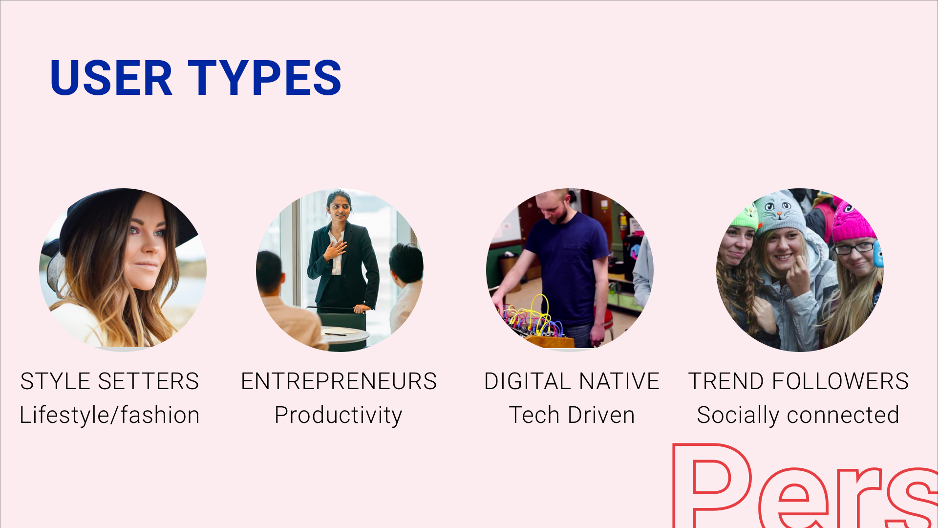
Not all our users were native to London and New York, some came from countries including Egypt, Nigeria, Denmark, Australia and Uzbekistan. This helped us to achieve a very global research study.
Research Methods:
Social listening, In Depth Interviews, Video Diaries
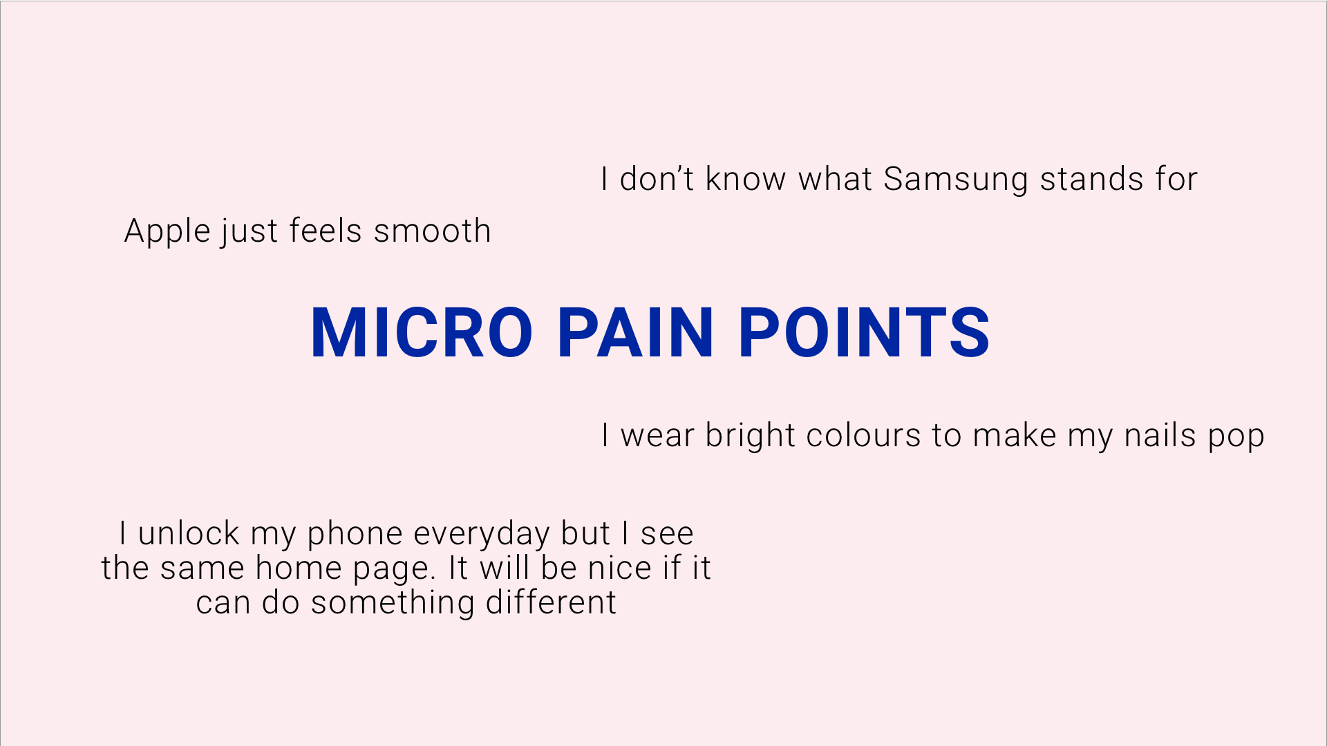
Top Level Pain points:
After clustering research, lack of positive perception of Samsung became the primarily issue when it comes top differentiating from Android.
Ideation
After we were briefed on aspects of the phone to work on, we started identifying a solid set of major features by creating quick sketches, I mapped out the information architecture to show the hierarchy of major and minor features. It will give me an idea of how to organise content and how many interactions or screens it'll take to complete a task. The whole point of designing in low fidelity is so I do not over invest. The ability to move fast so we can try differnt everything possible options
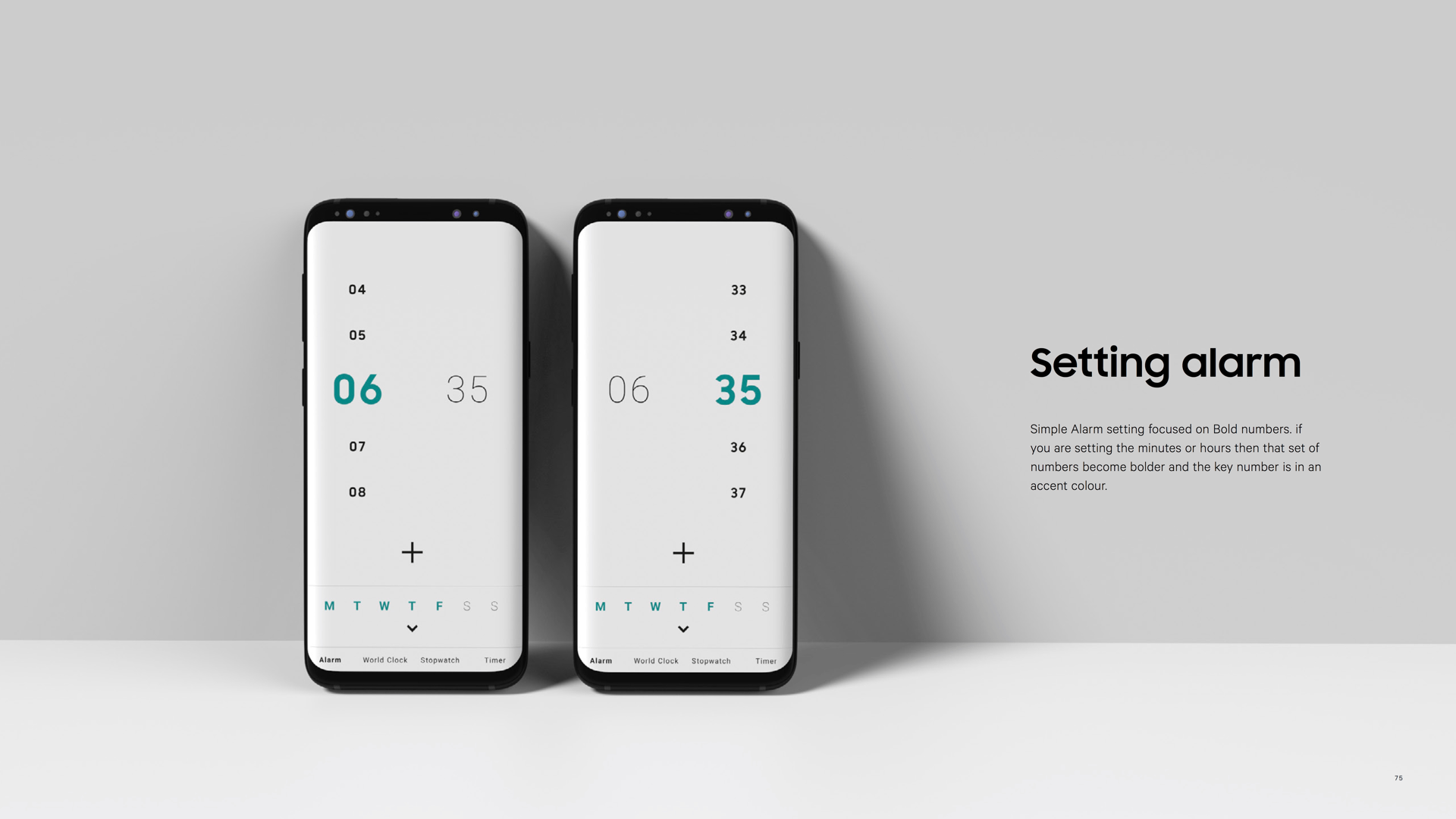
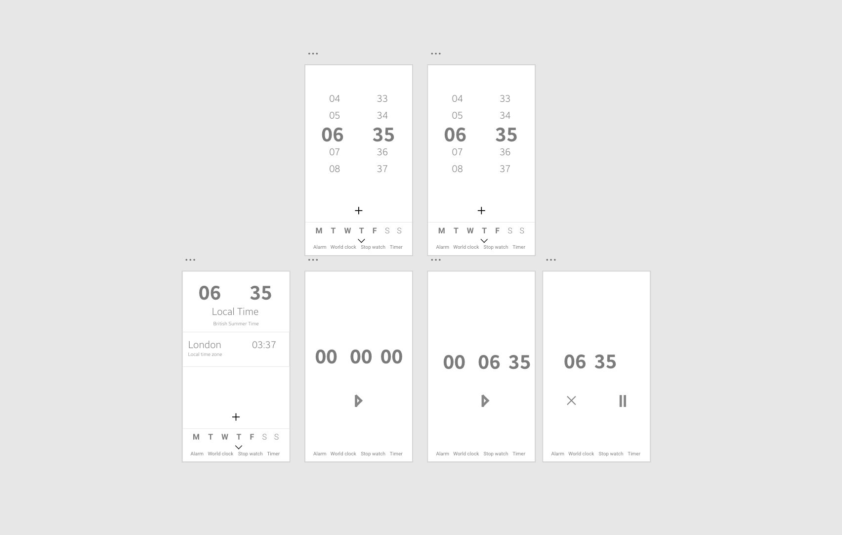
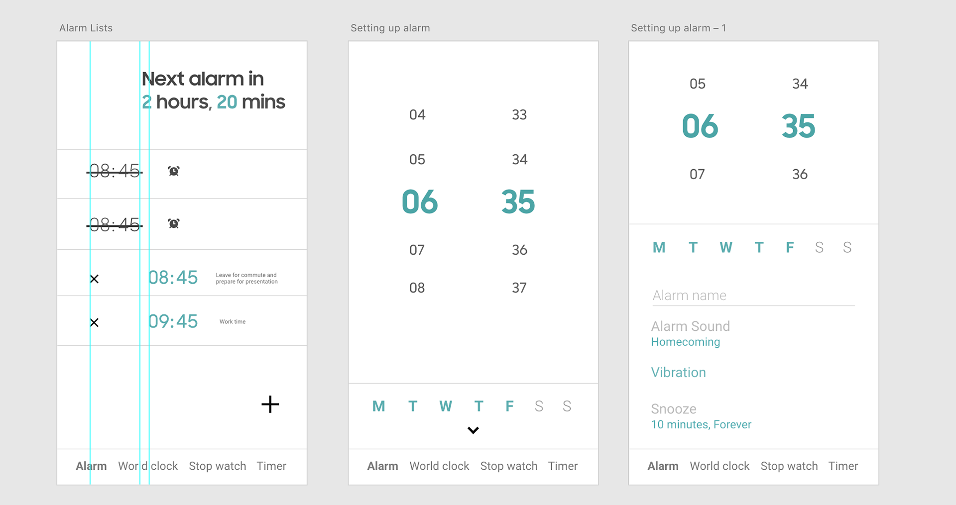
Designing the Alarm clock
The time is by far the most sought out data. Though hiding in sight, it also gives us the opportunity to make the alarm both a productive UX and emotional focus. First broke down the user flow of the clock app from alarm to timer to world clock and stopwatch. This allows me to apply a bold approach across macro level and micro level.
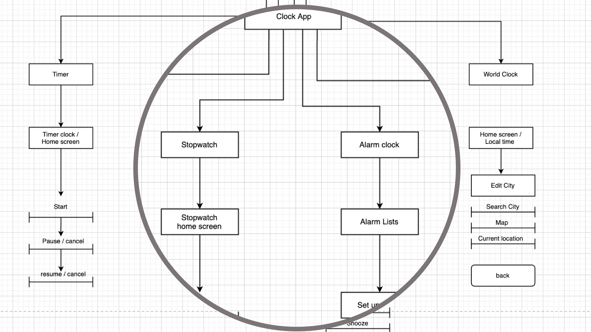
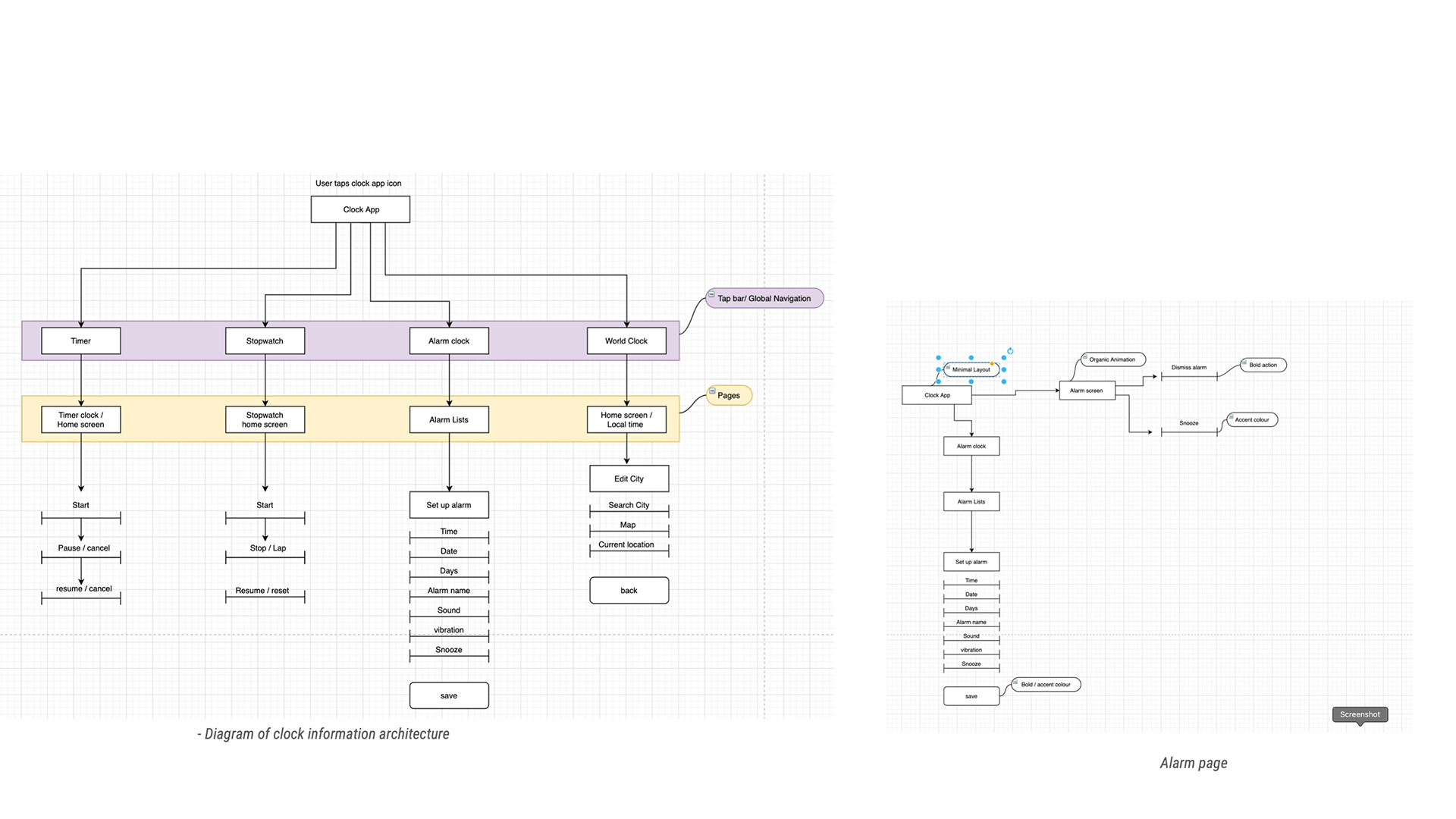
Diagrams of clock
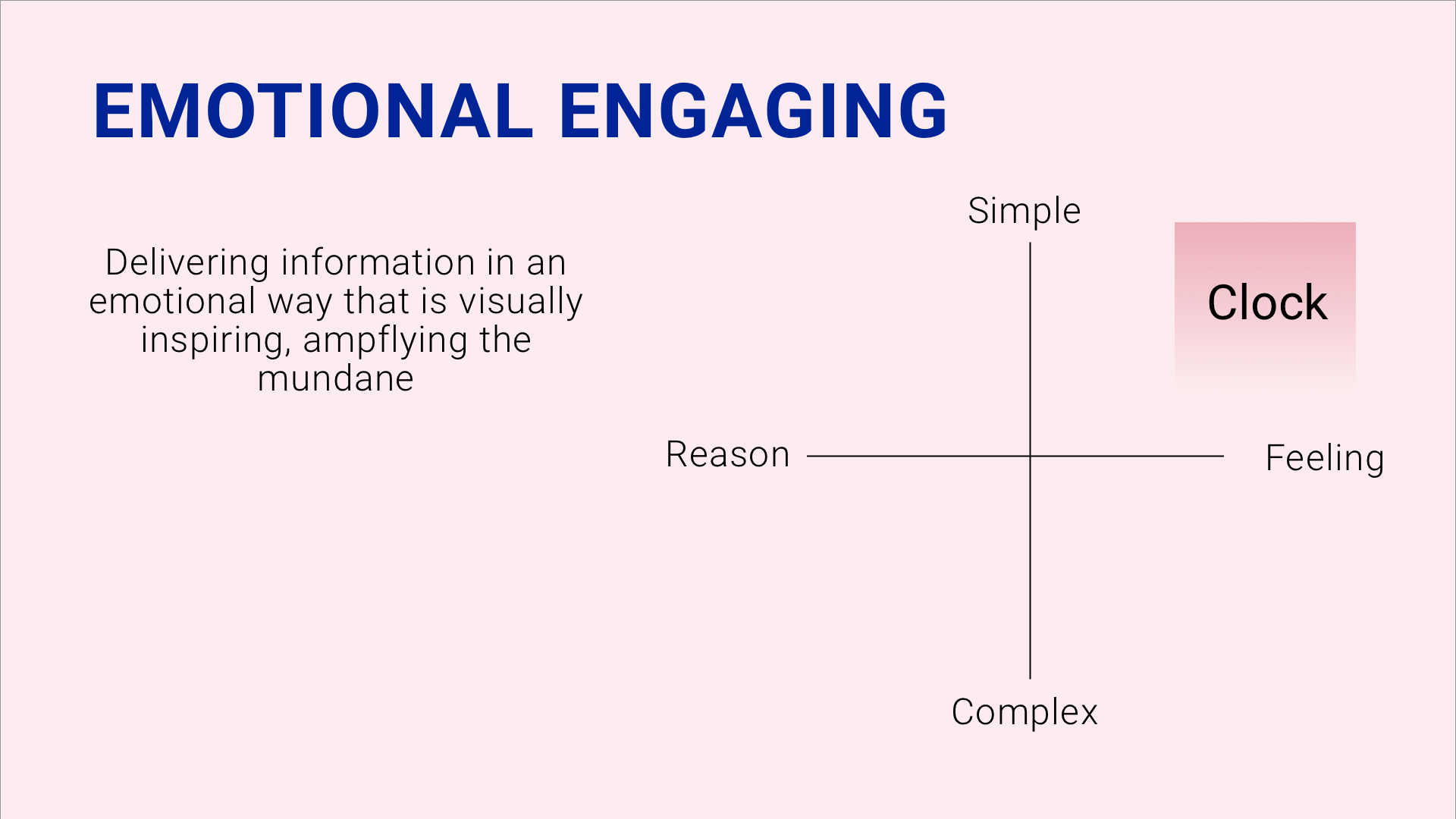
In order to amplify the everyday, I had look at the role clock will play in emotional engagements on a daily basis
Systems were defined in advance first to limit different types of design as each different members took different responsibilities of designs or screens.
Things that were systemise:
Font size, font weight, line height, colour, margin, padding, width, opacity, height e.t.c
Colour system
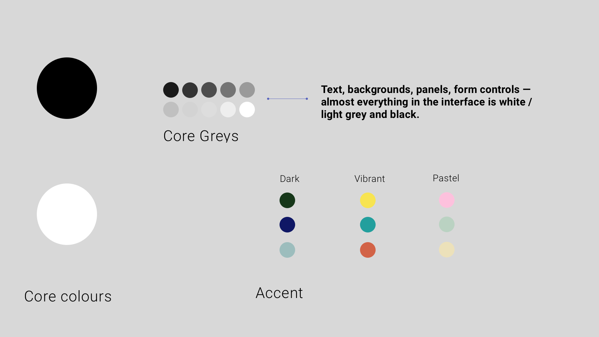
Colour system

Accent colour system
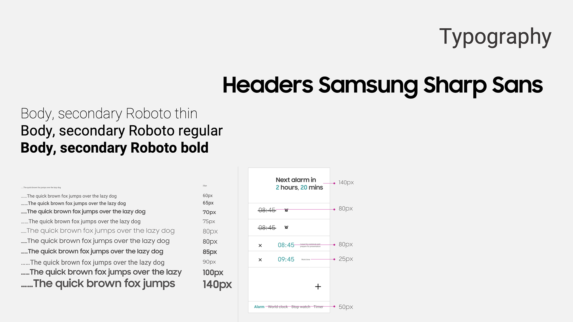
Type size margins
Decluttering the interface
The importance of the layout is to give space around components. The majority of grids are structured and pragmatic, with more emotional UX, having organic layouts, the alignment is the proportion of free space. The base colour is either white or black for night and day mode. the base colour also plays with grey tones to create a neutral backdrop for content to create the focus, such as bold accent and imagery / patterns.
Designing in mid fidelity, I designed in greyscale to use more contrast, spacing and size to do the heavy. It is far more challenging and thought the interface will be easier to understand.
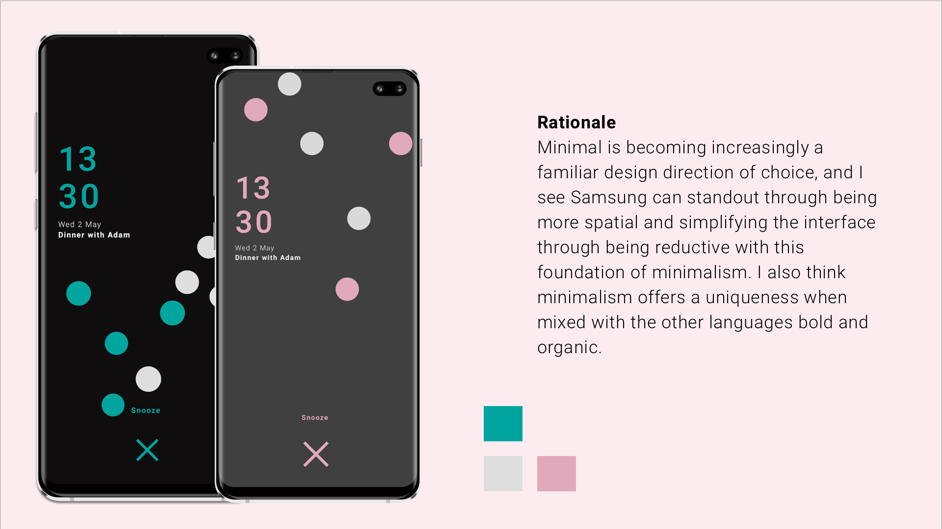
Adding the BOLD aspect
Bold builds on the foundations of a minimal aesthetic while offering a uniqueness that minimalism cannot on its own, it amplifies the design and creates a rhythm. Bold is an accent which is added to the design through an accent colour, header type or graphic accent.
Amplifying the interface with Organic
Organic adds a humanised element to the design that makes the UX feel alive and is integrated into the design through multiple facets.
It firstly is the motion design that is added to minimal and bold information to bring it alive. it should be applied to elements such as key interaction, standout transitions and key elements such as primary type.
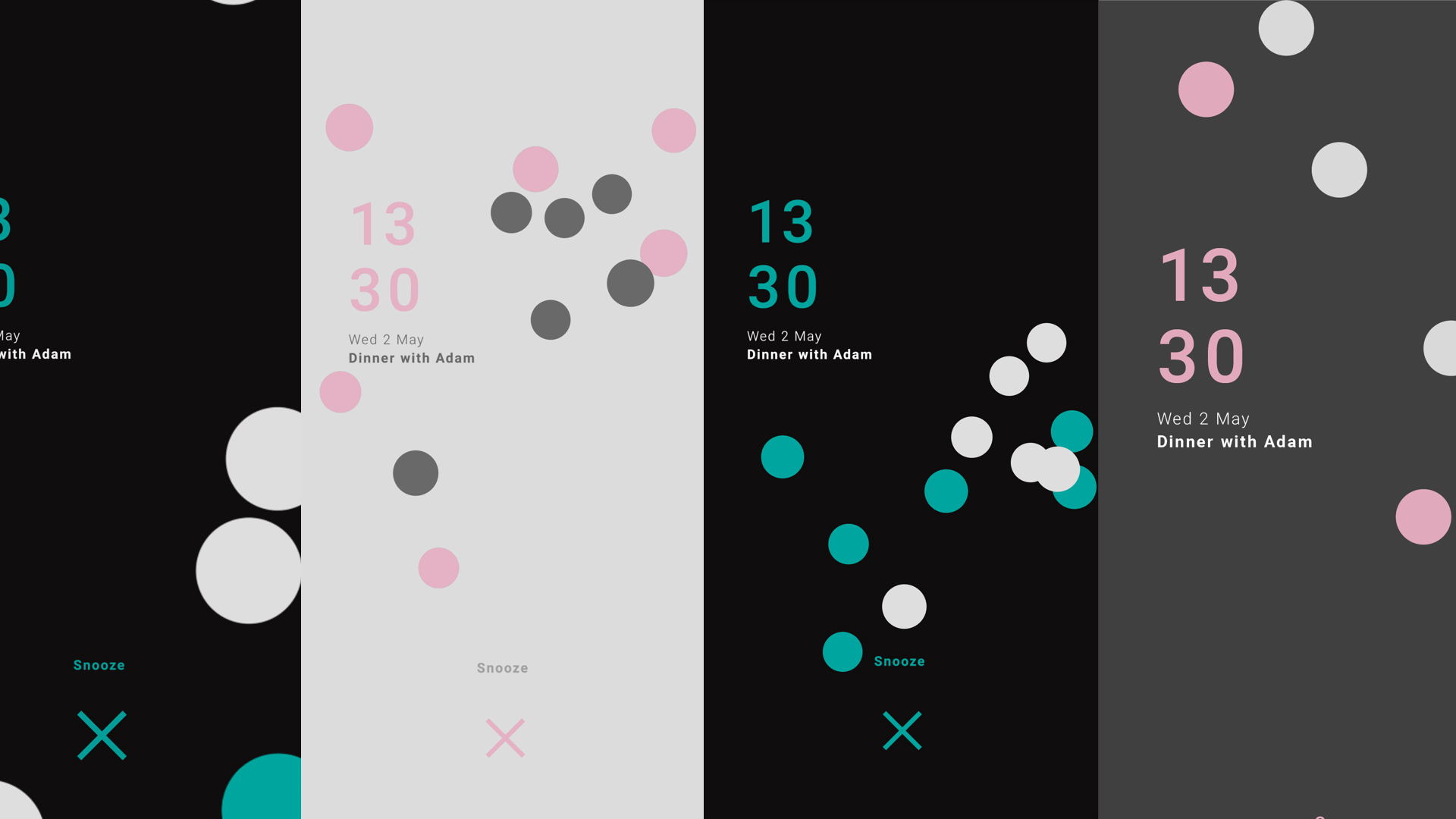
Dismissing the Alarm
Dismissing screen was a good way to amplify the everyday. Showcasing organic movements as a way ease the user in everyday.
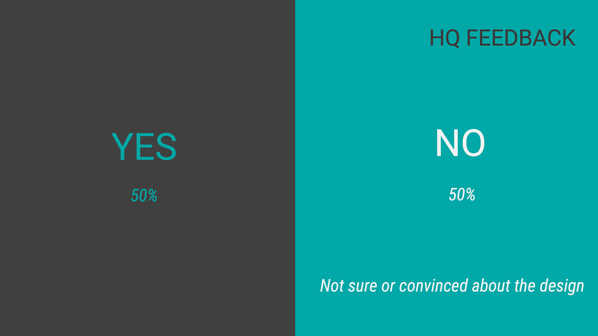
Validation
My manager was very happy with the design but 50% of the designers in HQ were unconvinced about the visual look. They liked the animation but felt it was not perfect fit the project.
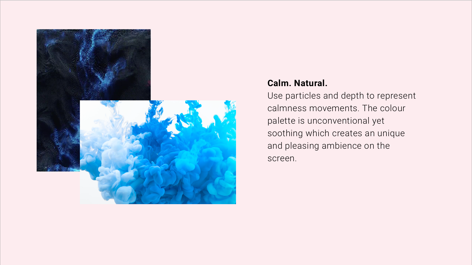
After going to back to some desk research, I started to experiment with particles then my manager suggested the calmness of waterfalls and does not being mind being woken to it. This made sense from our research as people wanted more amplified but nuance interactions.

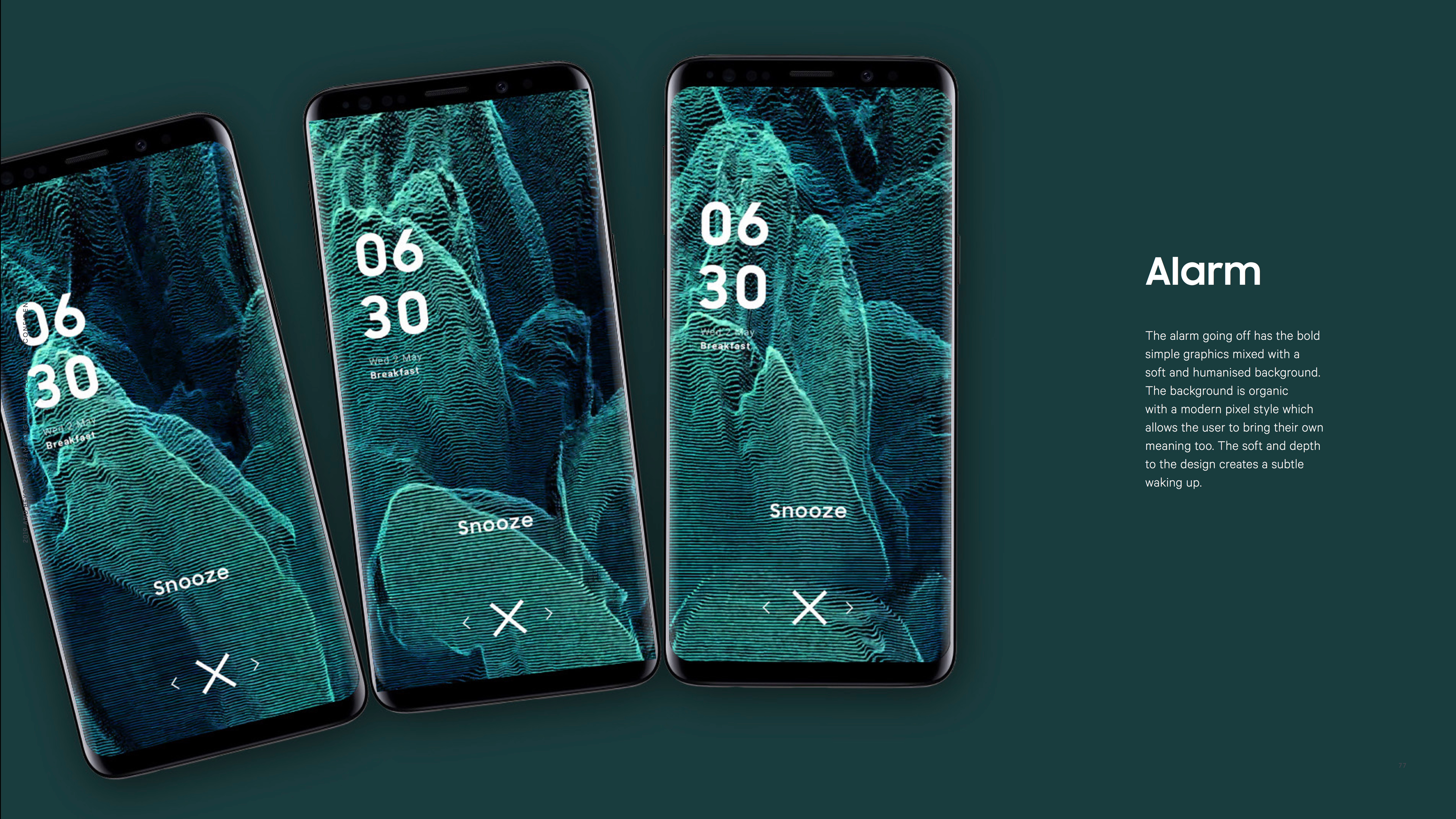
Using waterfalls movements to drive the dismiss screen interactions.
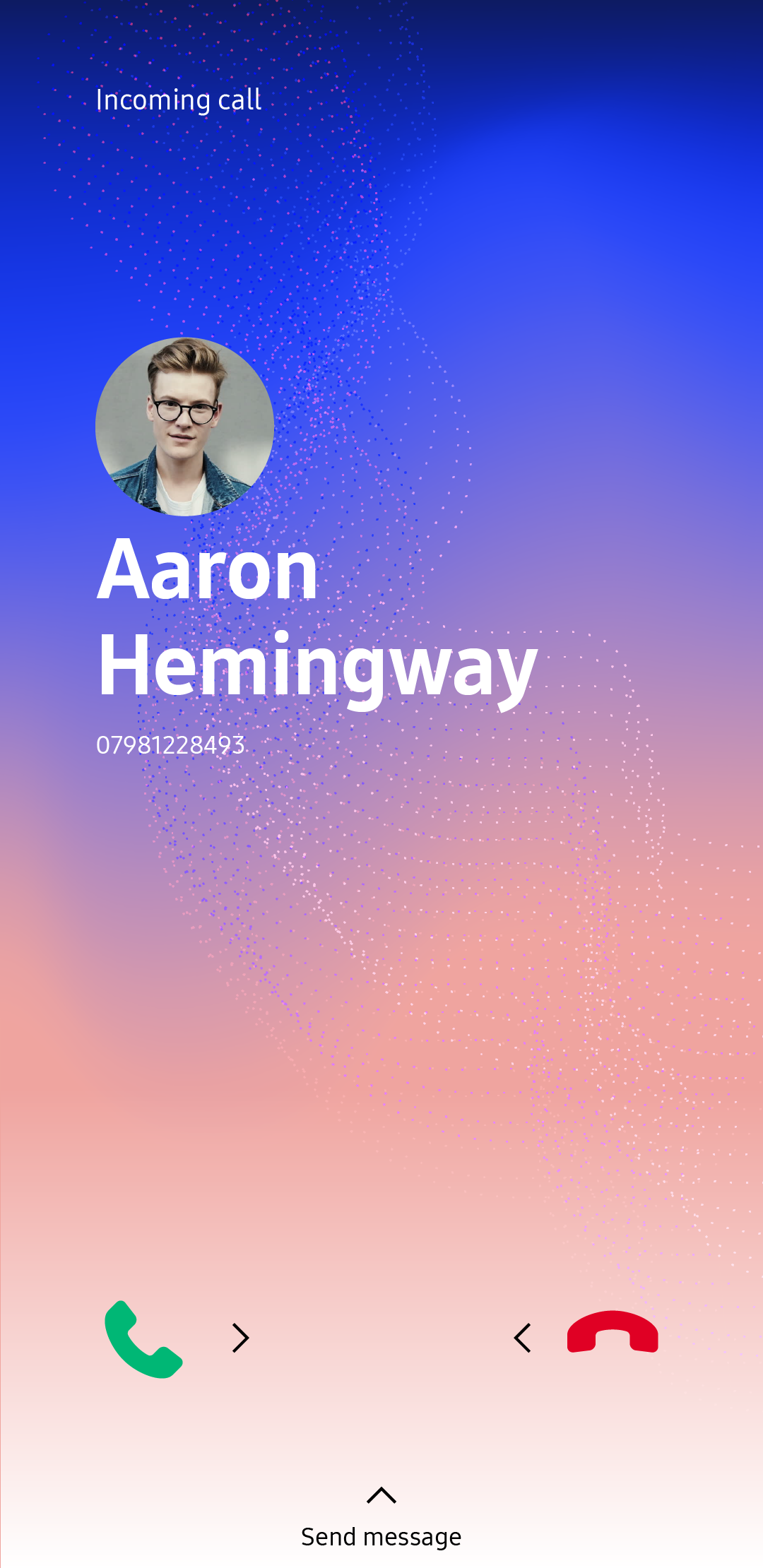
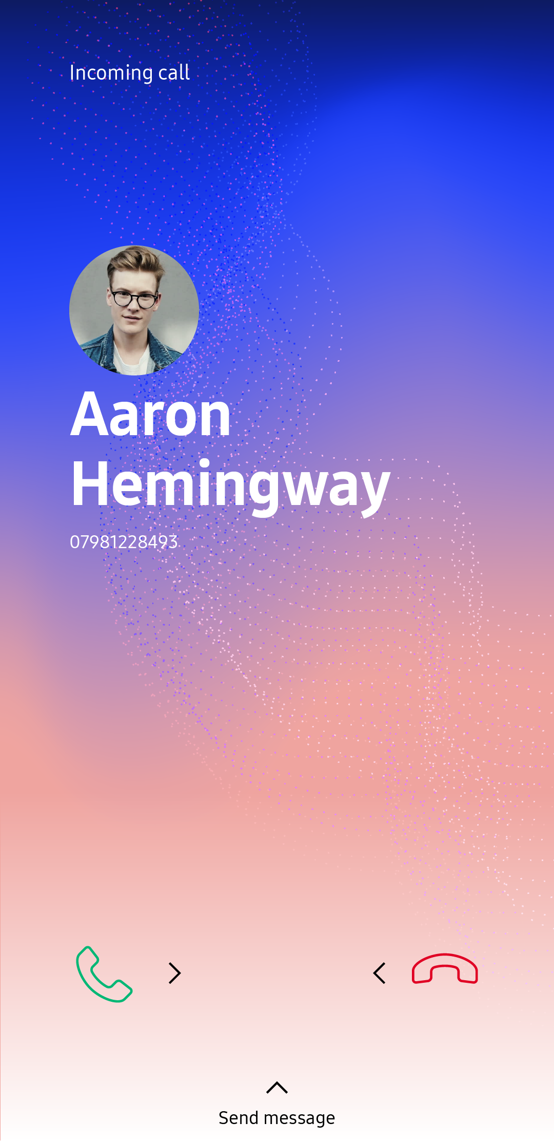
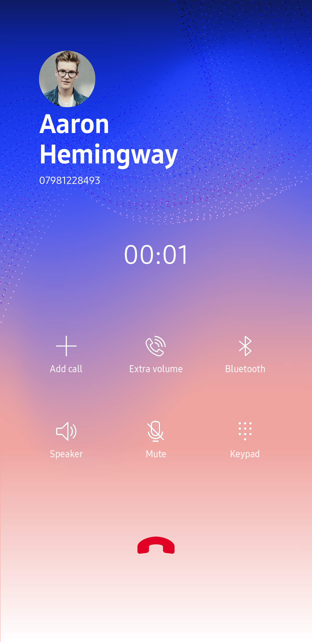
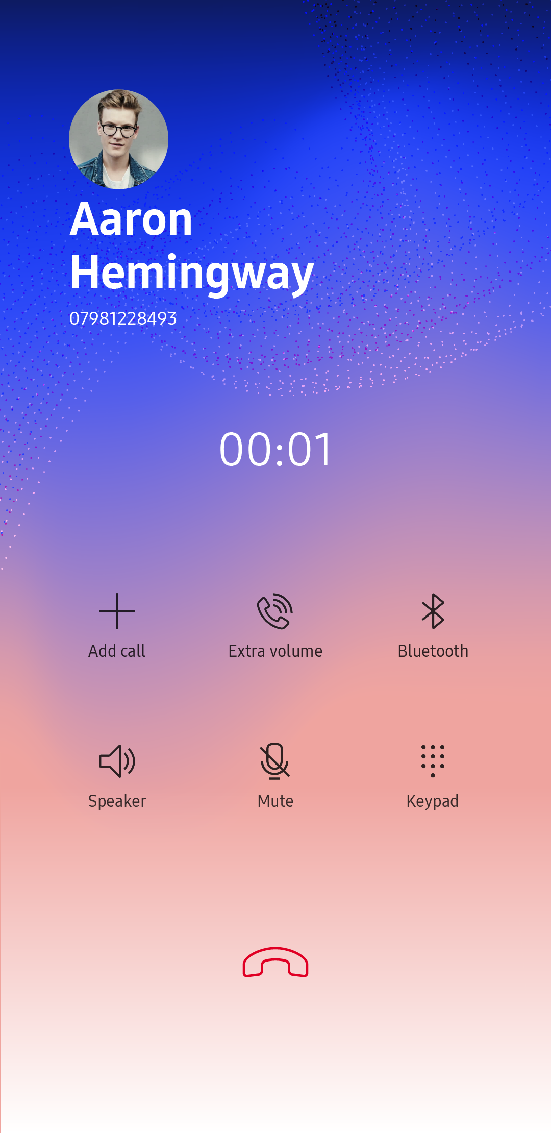
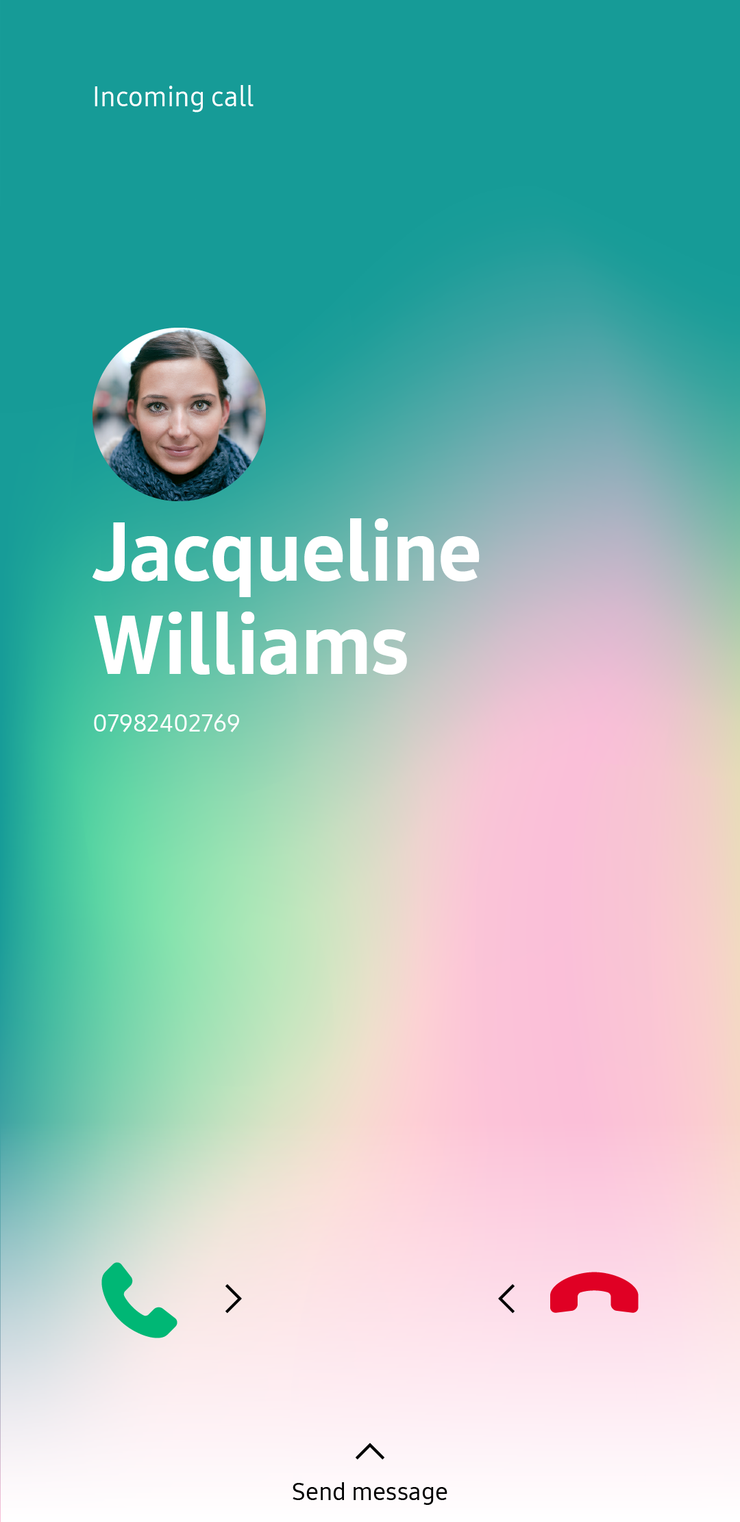
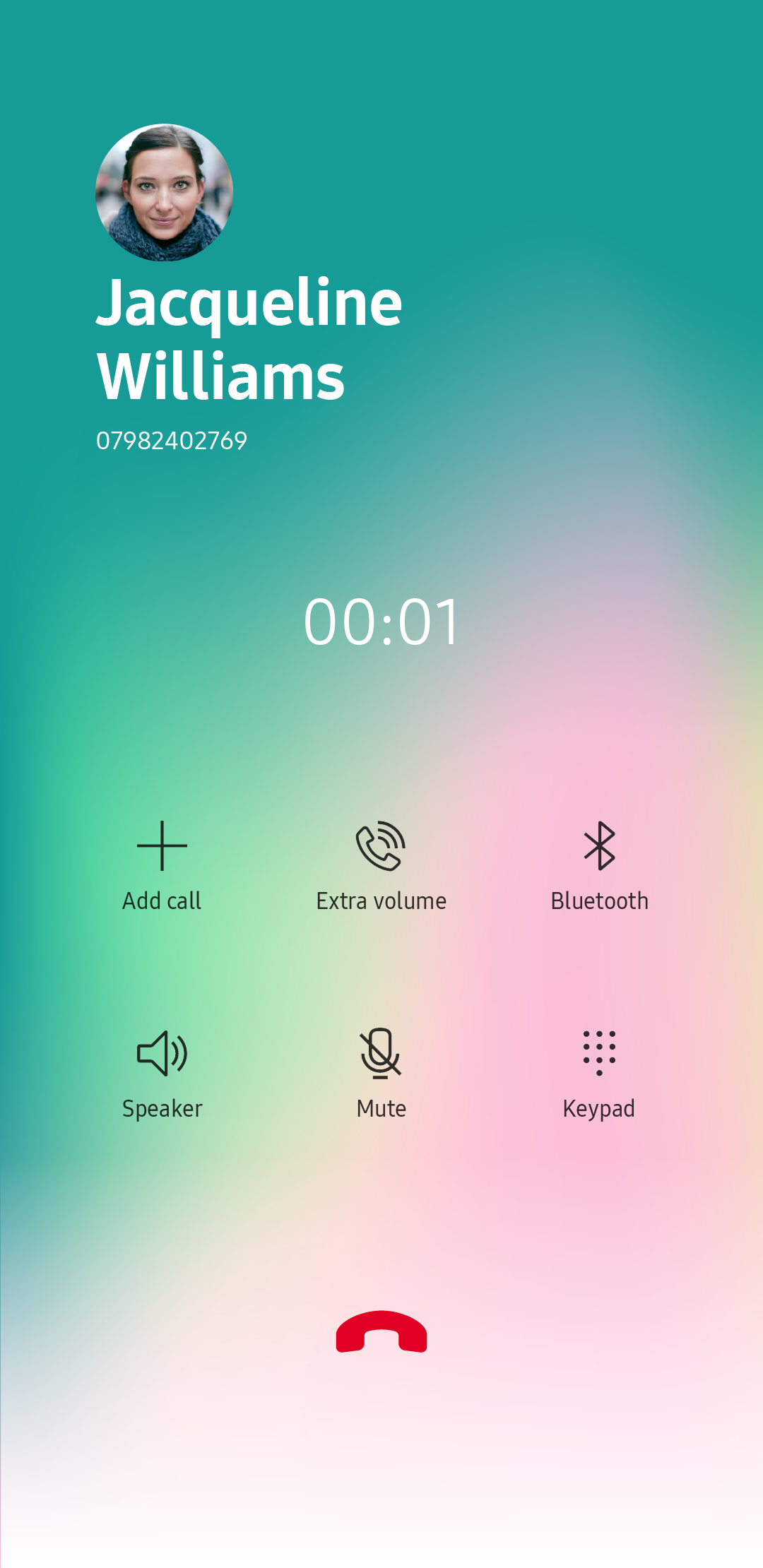
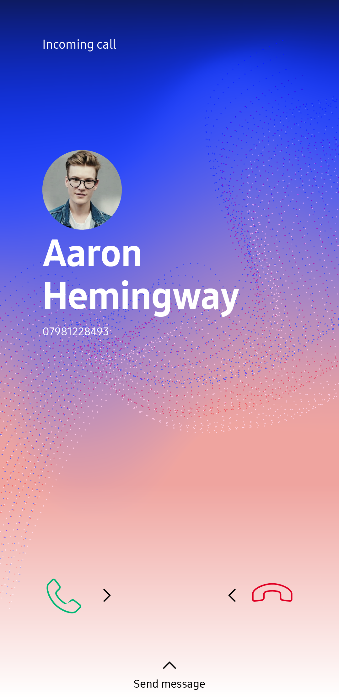
Call screens
Throughout this project, I was also responsible for call screens, and music player.
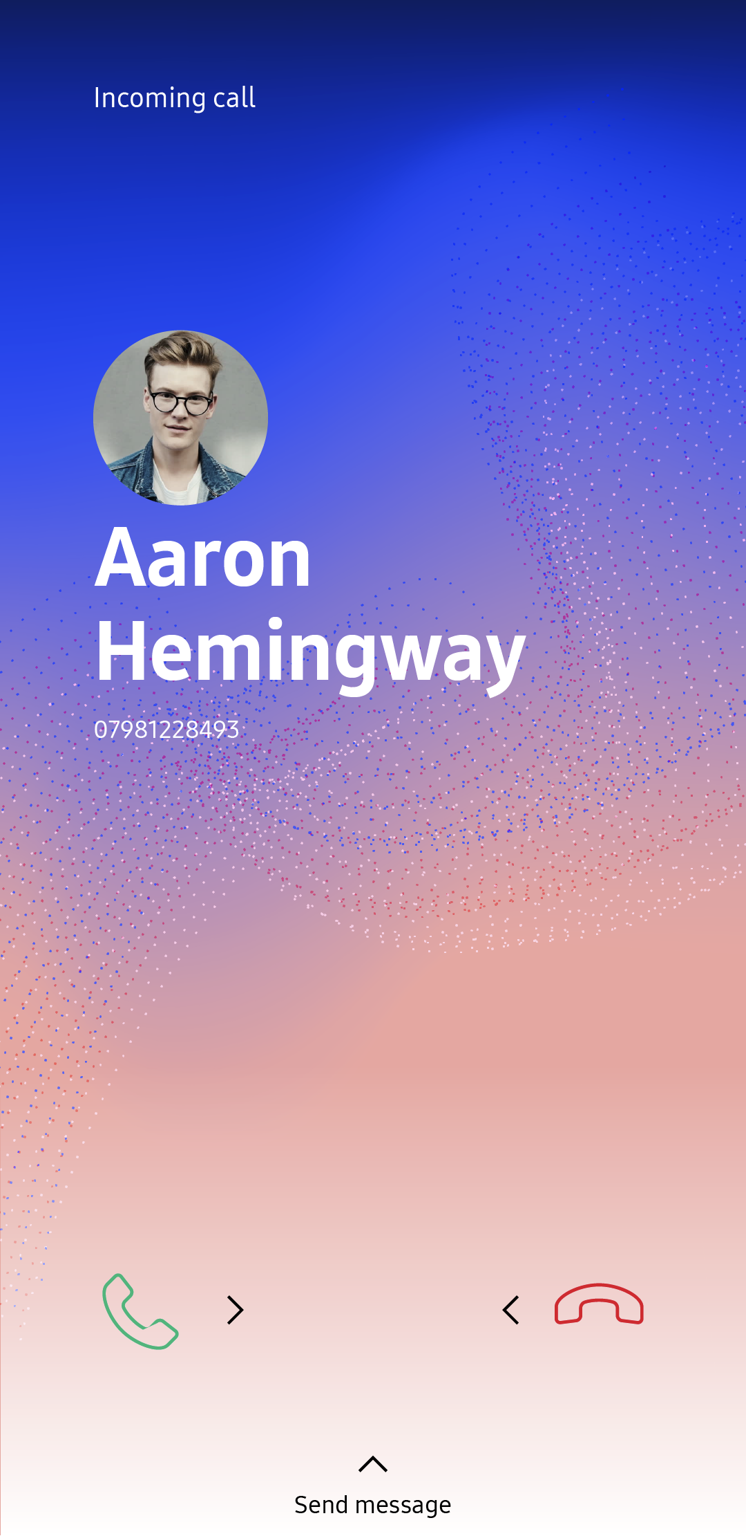
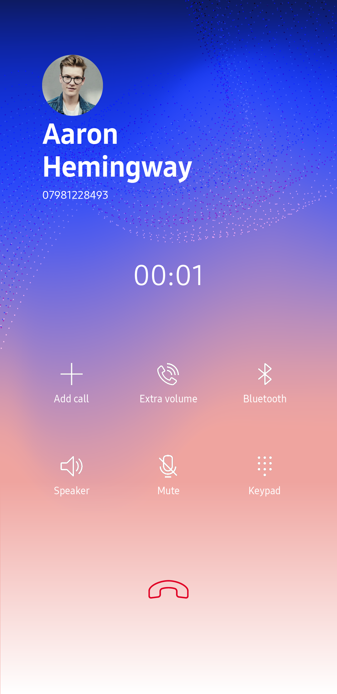
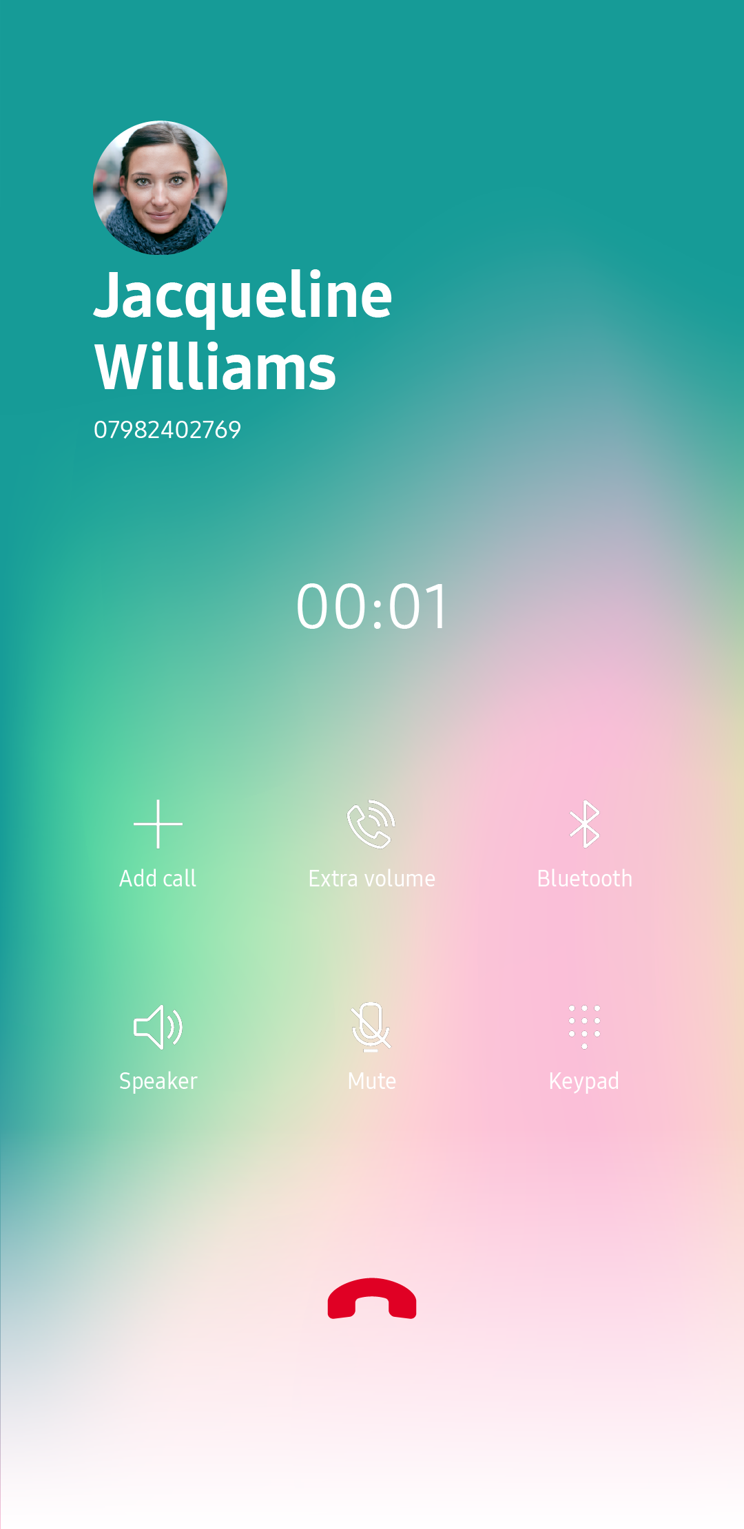
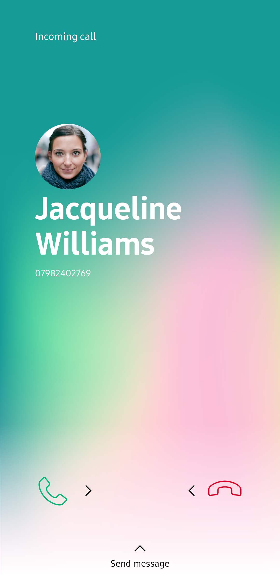

Call screen 1
Call screen 2
Music player